Layouts
Given that Flutter is a UI toolkit, you'll spend a lot of time creating layouts with Flutter widgets. In this section, you'll learn how to build layouts with some of the most common layout widgets. You'll use Flutter DevTools (also called Dart DevTools) to understand how Flutter is creating your layout. Finally, you'll encounter and debug one of Flutter's most common layout errors, the dreaded "unbounded constraints" error.
Understanding layout in Flutter
#The core of Flutter's layout mechanism is widgets. In Flutter, almost everything is a widget — even layout models are widgets. The images, icons, and text that you see in a Flutter app are all widgets. Things you don't see are also widgets, such as the rows, columns, and grids that arrange, constrain, and align the visible widgets.
You create a layout by composing widgets to build more complex widgets. For example, the diagram below shows 3 icons with a label under each one, and the corresponding widget tree:
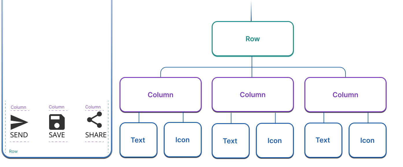
In this example, there's a row of 3 columns where each column contains an icon and a label. All layouts, no matter how complex, are created by composing these layout widgets.
Constraints
#Understanding constraints in Flutter is an important part of understanding how layout works in Flutter.
Layout, in a general sense, refers to the size of the widgets and their positions on the screen. The size and position of any given widget is constrained by its parent; it can't have any size it wants, and it doesn't decide its own place on the screen. Instead, size and position are determined by a conversation between a widget and its parent.
In the simplest example, the layout conversation looks like this:
- A widget receives its constraints from its parent.
- A constraint is just a set of 4 doubles: a minimum and maximum width, and a minimum and maximum height.
- The widget determines what size it should be within those constraints, and passes its width and height back to the parent.
- The parent looks at the size it wants to be and how it should be aligned, and sets the widget's position accordingly. Alignment can be set explicitly, using a variety of widgets like
Center, and the alignment properties onRowandColumn.
In Flutter, this layout conversation is often expressed with the simplified phrase, "Constraints go down. Sizes go up. Parent sets the position."
Box types
#In Flutter, widgets are rendered by their underlying RenderBox objects. These objects determine how to handle the constraints they're passed.
Generally, there are three kinds of boxes:
- Those that try to be as big as possible. For example, the boxes used by
CenterandListView. - Those that try to be the same size as their children. For example, the boxes used by
TransformandOpacity - Those that try to be a particular size. For example, the boxes used by
ImageandText.
Some widgets, for example Container, vary from type to type based on their constructor arguments. The Container constructor defaults to trying to be as big as possible, but if you give it a width, for instance, it tries to honor that and be that particular size.
Others, for example Row and Column (flex boxes) vary based on the constraints they are given. Read more about flex boxes and constraints in the Understanding Constraints article.
Lay out a single widget
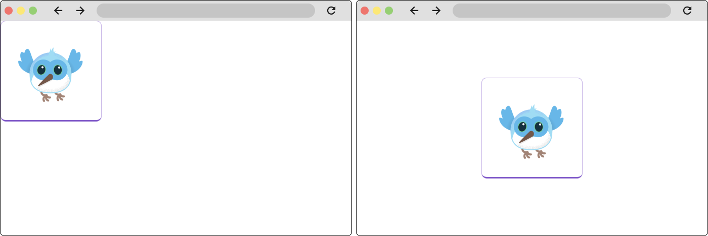
#To lay out a single widget in Flutter, wrap a visible widget, such as Text or Image with a widget that can change its position on a screen, such as a Center widget.
Widget build(BuildContext context) {
  return Center(
    child: BorderedImage(),
  );
}
The following figure shows a widget that isn't aligned on the left, and a widget that has been centered on the right.
All layout widgets have either of the following:
- A
childproperty if they take a single child—for example,Center,Container, orPadding. - A
childrenproperty if they take a list of widgets—for example,Row,Column,ListView, orStack.
Container
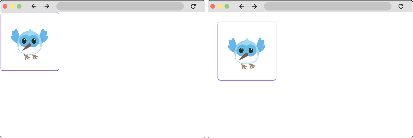
#Container is a convenience widget that's made up of several widgets responsible for layout, painting, positioning, and sizing. In regard to layout, it can be used to add padding and margins to a widget. There is also a Padding widget that could be used here to the same effect. The following example uses a Container.
Widget build(BuildContext context) {
  return Container(
    padding: EdgeInsets.all(16.0),
    child: BorderedImage(),
  );
}
The following figure shows a widget without padding on the left, and a widget with padding on the right.
To create more complex layouts in Flutter, you can compose many widgets. For example, you can combine Container and Center:
Widget build(BuildContext context) {
  return Center(
    Container(
      padding: EdgeInsets.all(16.0),
      child: BorderedImage(),
    ),
  );
}
Layout multiple widgets vertically or horizontally
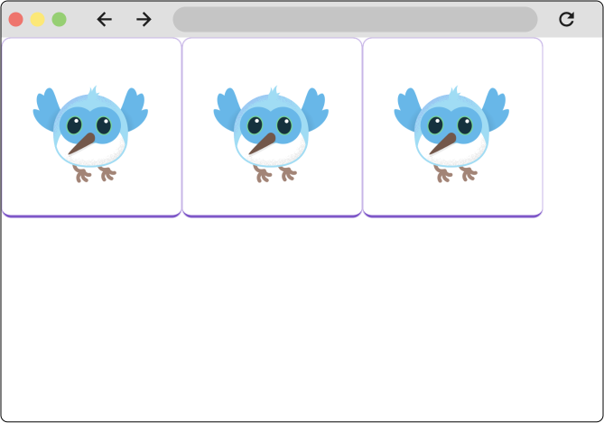
#One of the most common layout patterns is to arrange widgets vertically or horizontally. You can use a Row widget to arrange widgets horizontally, and a Column widget to arrange widgets vertically. The first figure on this page used both.
This is the most basic example of using a Row widget.Widget build(BuildContext context) {
return Row(
children: [
BorderedImage(),
BorderedImage(),
BorderedImage(),
],
);
}
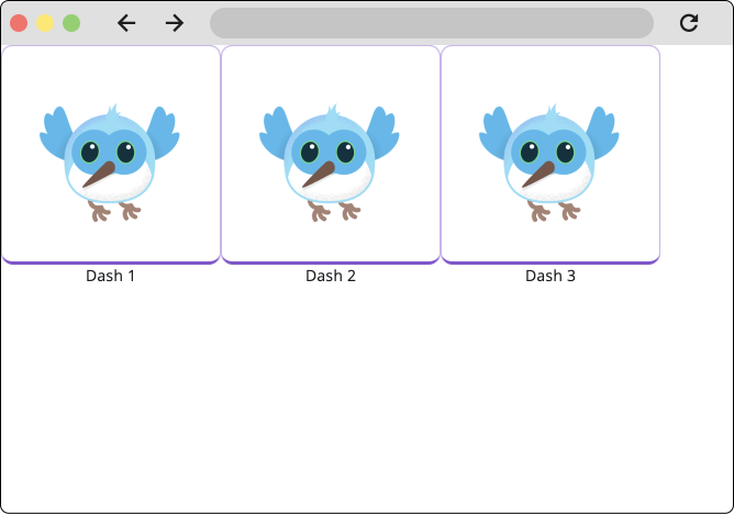
Each child of Row or Column can be rows and columns themselves, combining to make a complex layout. For example, you could add labels to each of the images in the example above using columns.Widget build(BuildContext context) {
return Row(
children: [
Column(
children: [
BorderedImage(),
Text('Dash 1'),
],
),
Column(
children: [
BorderedImage(),
Text('Dash 2'),
],
),
Column(
children: [
BorderedImage(),
Text('Dash 3'),
],
),
],
);
}
Align widgets within rows and columns
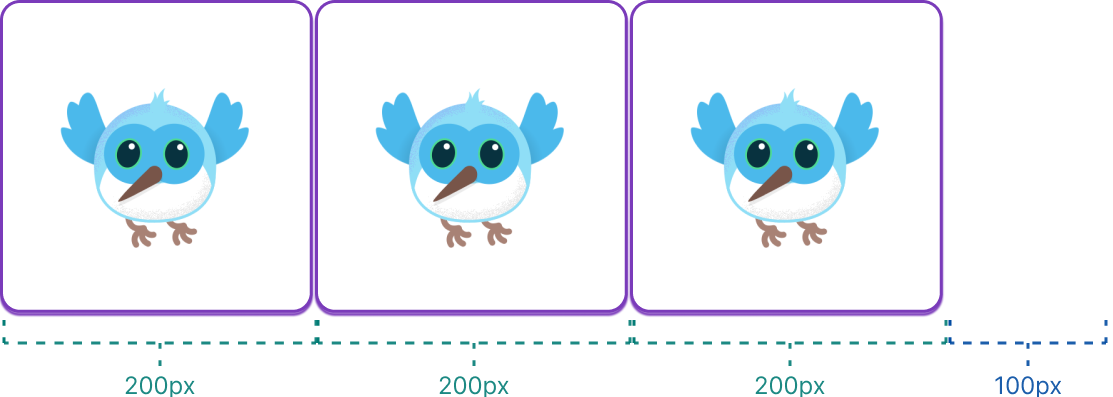
#In the following example, the widgets are each 200 pixels wide, and the viewport is 700 pixels wide. The widgets are consequently aligned to the left, one after the other, with all the extra space on the right.
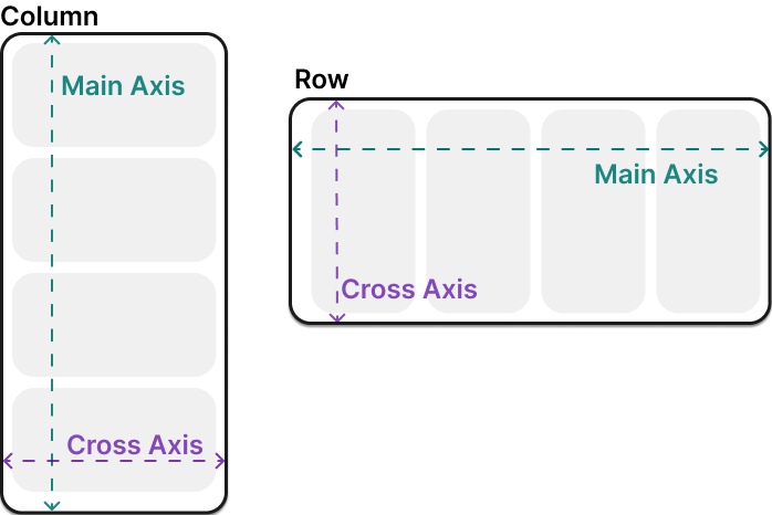
You control how a row or column aligns its children using the mainAxisAlignment and crossAxisAlignment properties. For a row, the main axis runs horizontally and the cross axis runs vertically. For a column, the main axis runs vertically and the cross axis runs horizontally.
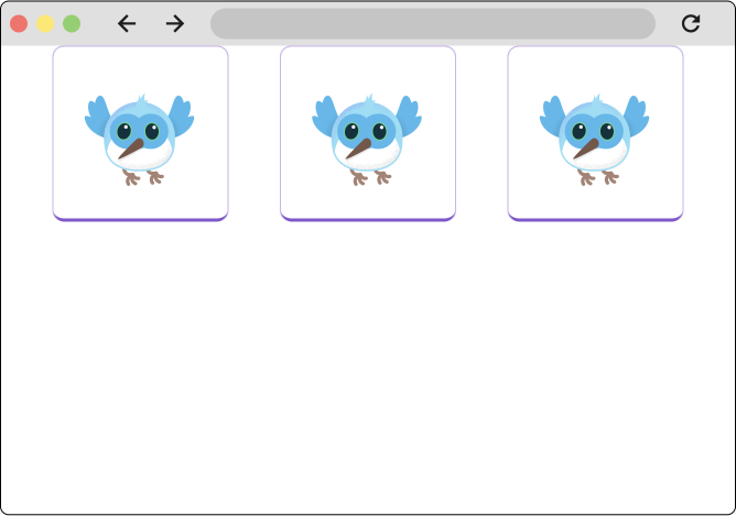
Setting the main axis alignment to spaceEvenly divides the free horizontal space evenly between, before, and after each image.Widget build(BuildContext context) {
return Row(
mainAxisAlignment: MainAxisAlignment.spaceEvenly,
children: [
BorderedImage(),
BorderedImage(),
BorderedImage(),
],
);
}
Columns work the same way as rows. The following example shows a column of 3 images, each is 100 pixels high. The height of the render box (in this case, the entire screen) is more than 300 pixels, so setting the main axis alignment to spaceEvenly divides the free vertical space evenly between, above, and below each image.
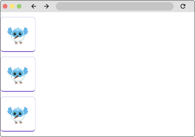
The MainAxisAlignment and CrossAxisAlignment enums offer a variety of constants for controlling alignment.
Flutter includes other widgets that can be used for alignment, notably the Align widget.
Sizing widgets within rows and columns
#When a layout is too large to fit a device, a yellow and black striped pattern appears along the affected edge. In this example, the viewport is 400 pixels wide, and each child is 150 pixels wide.
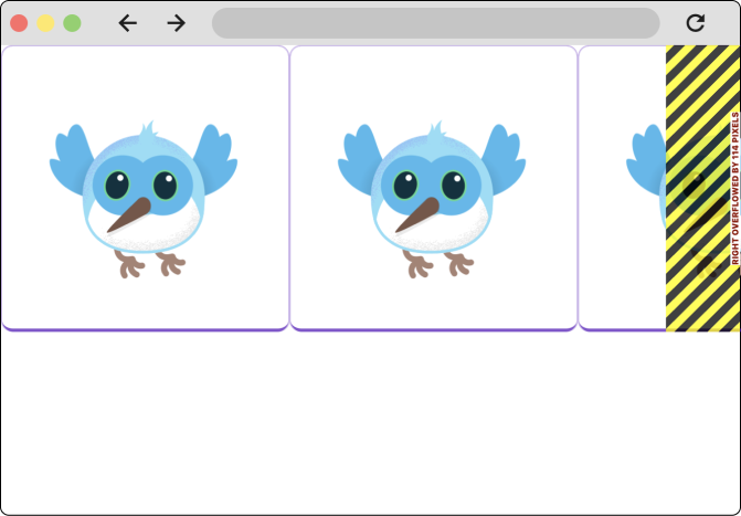
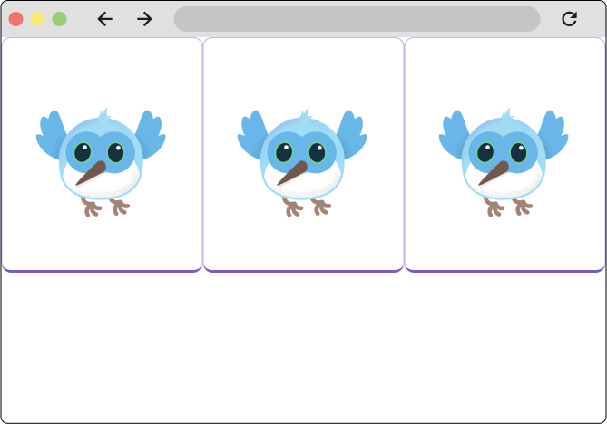
Widgets can be sized to fit within a row or column by using the Expanded widget. To fix the previous example where the row of images is too wide for its render box, wrap each image with an Expanded widget.Widget build(BuildContext context) {
return const Row(
children: [
Expanded(
child: BorderedImage(width: 150, height: 150),
),
Expanded(
child: BorderedImage(width: 150, height: 150),
),
Expanded(
child: BorderedImage(width: 150, height: 150),
),
],
);
}
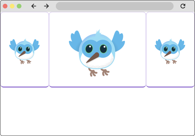
The Expanded widget can also dictate how much space a widget should take up relative to its siblings. For example, perhaps you want a widget to occupy twice as much space as its siblings. For this, use the Expanded widgets flex property, an integer that determines the flex factor for a widget. The default flex factor is 1. The following code sets the flex factor of the middle image to 2:Widget build(BuildContext context) {
return const Row(
children: [
Expanded(
child: BorderedImage(width: 150, height: 150),
),
Expanded(
flex: 2,
child: BorderedImage(width: 150, height: 150),
),
Expanded(
child: BorderedImage(width: 150, height: 150),
),
],
);
}
DevTools and debugging layout
#In certain situations, a box's constraint is unbounded, or infinite. This means that either the maximum width or the maximum height is set to double.infinity. A box that tries to be as big as possible won't function usefully when given an unbounded constraint and, in debug mode, throws an exception.
The most common case where a render box ends up with an unbounded constraint is within a flex box (Row or Column), and within a scrollable region (such as ListView and other ScrollView subclasses). ListView, for example, tries to expand to fit the space available in its cross-direction (perhaps it's a vertically-scrolling block and tries to be as wide as its parent). If you nest a vertically scrolling ListView inside a horizontally scrolling ListView, the inner list tries to be as wide as possible, which is infinitely wide, since the outer one is scrollable in that direction.
Perhaps the most common error you'll run into while building a Flutter application is due to incorrectly using layout widgets, and is referred to as the "unbounded constraints" error.
If there was only one type error you should be prepared to confront when you first start building Flutter apps, it would be this one.
Watch on YouTube in a new tab: "Decoding Flutter: Unbounded height and width"
Scrolling widgets
#Flutter has many built-in widgets that automatically scroll and also offers a variety of widgets that you can customize to create specific scrolling behavior. On this page, you'll see how to use the most common widget for making any page scrollable, as well as a widget for creating scrollable lists.
ListView
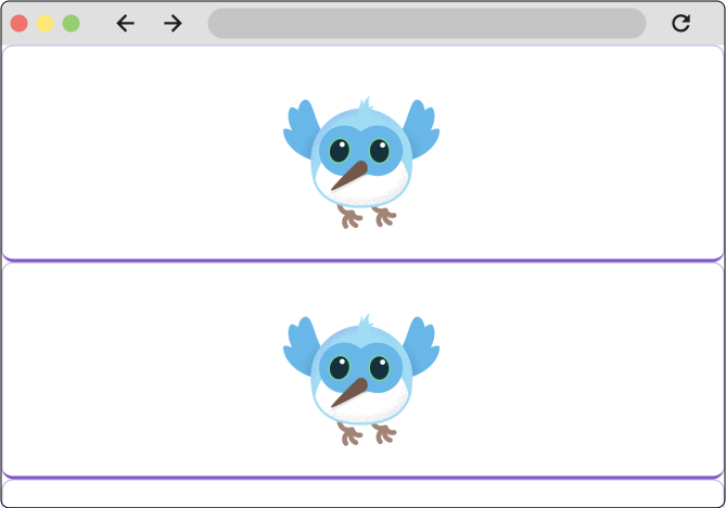
#ListView is a column-like widget that automatically provides scrolling when its content is longer than its render box. The most basic way to use a ListView is very similar to using a Column or Row. Unlike a column or row, a ListView requires its children to take up all the available space on the cross axis, as shown in the example below.Widget build(BuildContext context) {
return ListView(
children: const [
BorderedImage(),
BorderedImage(),
BorderedImage(),
],
);
}
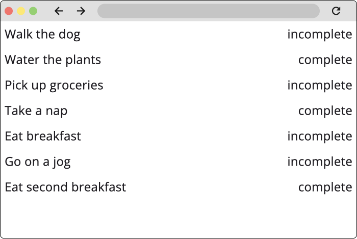
ListViews are commonly used when you have an unknown or very large (or infinite) number of list items. When this is the case, it's best to use the ListView.builder constructor. The builder constructor only builds the children that are currently visible on screen.
In the following example, the ListView is displaying a list of to-do items. The todo items are being fetched from a repository, and therefore the number of todos is unknown.final List<ToDo> items = Repository.fetchTodos();
Widget build(BuildContext context) {
return ListView.builder(
itemCount: items.length,
itemBuilder: (context, idx) {
var item = items[idx];
return Padding(
padding: const EdgeInsets.all(8.0),
child: Row(
mainAxisAlignment: MainAxisAlignment.spaceBetween,
children: [
Text(item.description),
Text(item.isComplete),
],
),
);
},
);
}
Adaptive layouts
#Because Flutter is used to create mobile, tablet, desktop, and web apps, it's likely you'll need to adjust your application to behave differently depending on things like screen size or input device. This is referred to as making an app adaptive and responsive.
One of the most useful widgets in making adaptive layouts is the LayoutBuilder widget. LayoutBuilder is one of many widgets that uses the "builder" pattern in Flutter.
The builder pattern
#In Flutter, you'll find several widgets that use the word "builder" in their names or in their constructors. The following list isn't exhaustive:
These different "builders" are useful for solving different problems. For example, the ListView.builder constructor is primarily used to lazily render items in a list, while the Builder widget is useful for gaining access to the BuildContext in deeply widget code.
Despite their different use cases, these builders are unified by how they work. Builder widgets and builder constructors all have arguments called 'builder' (or something similar, like itemBuilder in the case of ListView.builder), and the builder argument always accepts a callback. This callback is a builder function. Builder functions are callbacks that pass data to the parent widget, and the parent widget uses those arguments to build and return the child widget. Builder functions always pass in at least one argument–the build context– and generally at least one other argument.
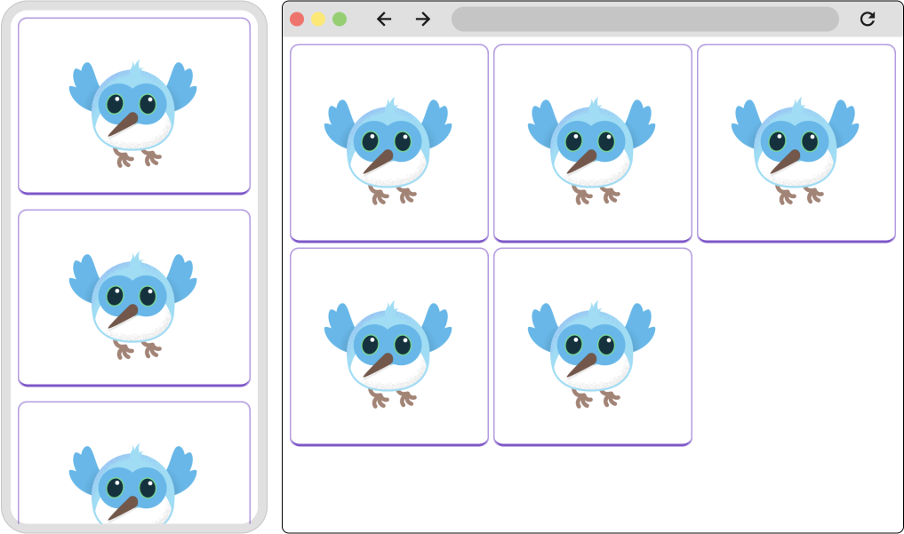
For example, the LayoutBuilder widget is used to create responsive layouts based on the size of the viewport. The builder callback body is passed the BoxConstraints that it receives from its parent, along with the widgets 'BuildContext'. With these constraints, you can return a different widget based on the available space.
Watch on YouTube in a new tab: "LayoutBuilder (Flutter Widget of the Week)"
In the following example, the widget returned by the LayoutBuilder changes based on whether the viewport is less than or equal 600 pixels, or greater than 600 pixels.Widget build(BuildContext context) {
return LayoutBuilder(
builder: (BuildContext context, BoxConstraints constraints) {
if (constraints.maxWidth <= 600) {
return _MobileLayout();
} else {
return _DesktopLayout();
}
},
);
}
Meanwhile, the itemBuilder callback on the ListView.builder constructor is passed the build context and an int. This callback is called once for every item in the list, and the int argument represents the index of the list item. The first time the itemBuilder callback is called when Flutter is building the UI, the int passed to the function is 0, the second time it's 1, and so on.
This allows you to provide specific configuration based on the index. Recall the example above using theListView.builder constructor:
final List<ToDo> items = Repository.fetchTodos();

Widget build(BuildContext context) {
  return ListView.builder(
    itemCount: items.length,
    itemBuilder: (context, idx) {
      var item = items[idx];
      return Padding(
        padding: const EdgeInsets.all(8.0),
        child: Row(
          mainAxisAlignment: MainAxisAlignment.spaceBetween,
          children: [
            Text(item.description),
            Text(item.isComplete),
          ],
        ),
      );
    },
  );
}
This example code uses the index that's passed into the builder to grab the correct todo from the list of items, and then displays that todo's data in the widget that is returned from the builder.
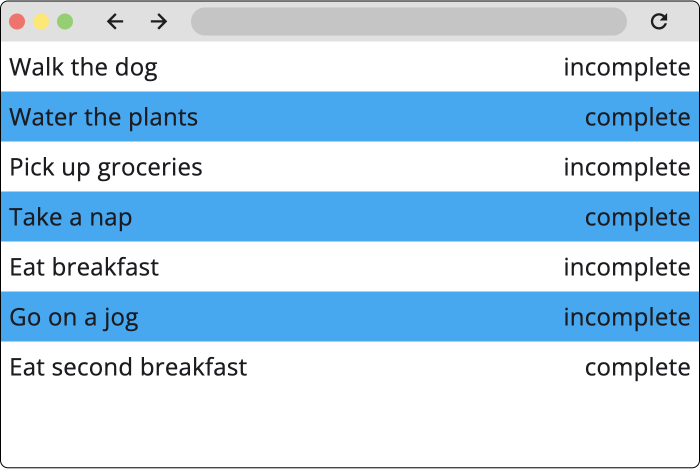
To exemplify this, the following example changes the background color of every other list item.final List<ToDo> items = Repository.fetchTodos();
Widget build(BuildContext context) {
return ListView.builder(
itemCount: items.length,
itemBuilder: (context, idx) {
var item = items[idx];
return Container(
color: idx % 2 == 0 ? Colors.lightBlue : Colors.transparent,
padding: const EdgeInsets.all(8.0),
child: Row(
mainAxisAlignment: MainAxisAlignment.spaceBetween,
children: [
Text(item.description),
Text(item.isComplete),
],
),
);
},
);
}
Additional resources
#- Common layout widgets and concepts
- Video: OverlayPortal—Flutter Widget of the Week
- Video: Stack—Flutter Widget of the Week
- Tutorial: Layouts in Flutter
- Documentation: Stack documentation
- Sizing and positioning widgets
- Scrollable widgets
- Example code: Work with long lists
- Example code: Create a horizontal list
- Example code: Create a grid list
- Video: ListView—Flutter Widget of the Week
- Adaptive Apps
- Tutorial: Adaptive Apps codelab
- Video: MediaQuery—Flutter Widget of the Week
- Video: Building platform adaptive apps
- Video: Builder—Flutter Widget of the Week
API reference
#The following resources explain individual APIs.
Feedback
#As this section of the website is evolving, we welcome your feedback!
Unless stated otherwise, the documentation on this site reflects the latest stable version of Flutter. Page last updated on 2025-01-31. View source or report an issue.